Brand Studio

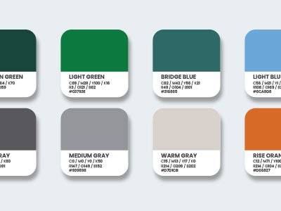
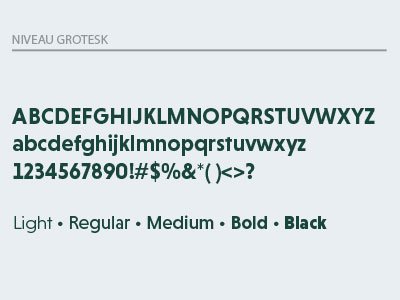
The MSU Research Foundation brand is the essence of who we are and how we communicate with our stakeholders. This guide is designed to ensure that our brand remains consistent, recognizable, and impactful across all platforms and materials.

This guide is for all team members, partners, and collaborators who contribute to our brand’s presence. By following these standards, we ensure that every interaction with our brand is clear, compelling, and aligned with our mission.

Consistency builds trust, reinforces our identity, and strengthens our connection with our stakeholders. By following this Brand Guide, we present a unified and professional image that reflects our mission, vision, and values.
This guide outlines our communication style, the shared language we use to define our work consistently and concisely, and the key elements of our visual identity. From logo usage and color palettes to typography and editorial guidelines, these standards help maintain a clear and professional brand presence.
Mission & Pillars

Our mission and pillars define the core of our work, guiding what we do and how we do it.

Shared Language

Our boilerplate, elevator pitch, and tagline allow us to describe our work consistently and concisely.

Voice & Tone

Our voice and tone reflect the distinct personality and style with which we communicate.

Editorial Style

Our foundational writing principles ensure consistency, clarity, and professionalism.

Logo

The MSU Research Foundation logo is the primary symbol of our brand identity.

Brand Colors

Our brand colors enhance recognition and ensure consistency.

Typography

The fonts we use establish a consistent visual identity, enhance recognition, and improve readability.

Subsidiaries

Guidelines for Spartan Innovations, Red Cedar Ventures, Michigan Rise, and Research park subsidiaries.