Typography

Typography is a key component of our visual identity, helping to establish a consistent and recognizable brand presence across all touchpoints. Four typefaces have been chosen for their clarity, versatility, and accessibility.

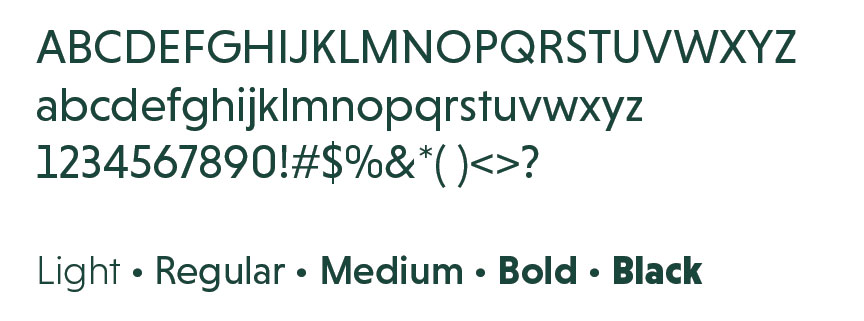
Niveau Grotesk

Niveau Grotesk is the font used in the MSU Research Foundation logo wordmark. When used sparingly in headlines and other applications, it reinforces our brand’s visual identity without compromising the logo’s integrity.

Recommended Use and Sizes:

  • Headlines (24-36 pt)
  • Callouts (18-24 pt)
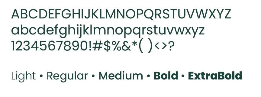
Poppins

Poppins is a multi-purpose sans serif font. Its clean, modern design makes it ideal for a variety of uses across print and digital materials.

Recommended Use and Sizes:

  • Subheads (18–24 pt)
  • Body text (12–16 pt)
  • Website (responsive sizes)
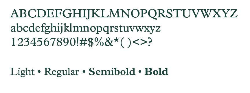
Plantin MT Pro

Plantin MT Pro is a serif font used as an accent to add variety and warmth to printed materials and social media graphics.

Recommended Use and Sizes:

  • Subheads (18–24 pt)
  • Pull quotes (16–20 pt)
  • Callouts (14–18 pt)
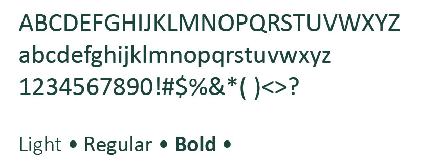
Calibri

Calibri is a widely accessible sans serif font that complements our brand, particularly for digital communications. As a system font available on both Windows and macOS, it ensures that electronic documents and emails display consistently across platforms.

Recommended Use and Sizes:

  • Microsoft Word documents (11–12 pt)
  • PowerPoint decks (14–18 pt)
  • Email communications (11–12 pt)