Brand Studio
Logo Overview
The MSU Research Foundation logo combines the Michigan State University helmet (“University Mark”) with a stylized rendering of the organization’s name (“Wordmark”) for clear recognition and readability. Two logo configurations are available: Wide and Stacked. Use the version that best fits available space while maintaining clarity and balance.


Each logo pack includes EPS, JPEG, and PNG formats in CMYK, RGB, Black (K), and White (W) variants. For editorial and approved partner use only. Do not alter colors or proportions. Contact marketing@msufoundation.org with any questions.
Wordmark
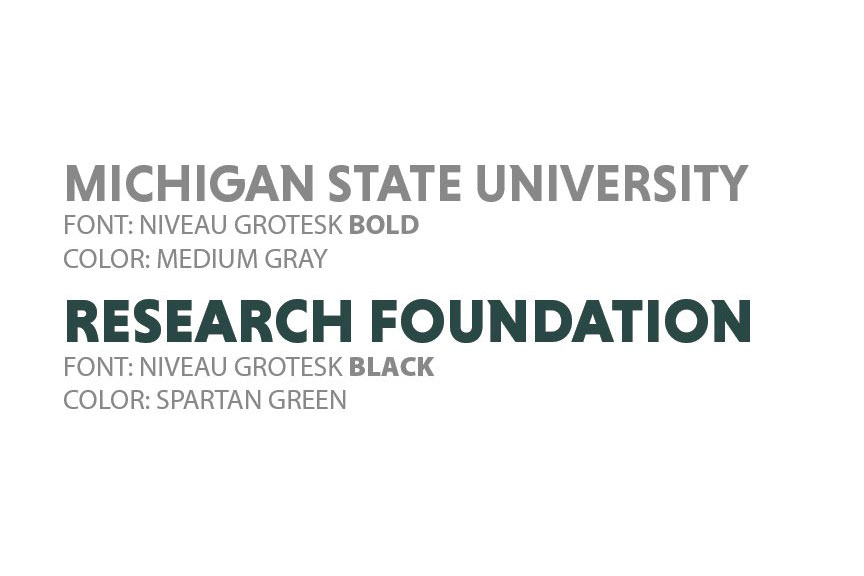
The wordmark is the standardized graphic representation of the MSU Research Foundation name. It uses Niveau Grotesk, chosen for its clean, modern design and strong legibility at any size. Subtle design details connect it visually to Michigan State University while preserving a distinct Foundation identity.
For embroidery or specialty applications, Niveau Grotesk may be substituted with a similar sans-serif font. Please contact Director of Communications for guidance.

Colors
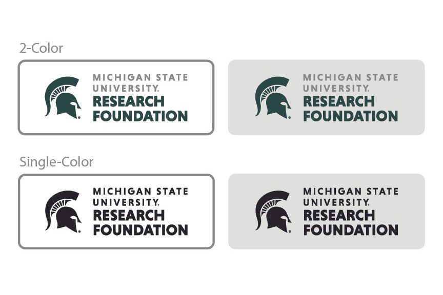
The logo includes two primary colors: Spartan Green and Medium Gray. When needed, the logo may also appear in a single brand-consistent color such as Black or White. (see all Brand Colors)
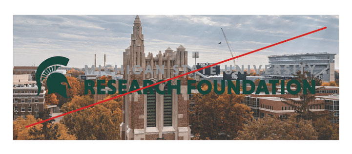
Backgrounds
The 2-Color logo works best on white or light backgrounds, including light photographs. Always ensure sufficient contrast between the background and all text elements, especially Medium Gray.
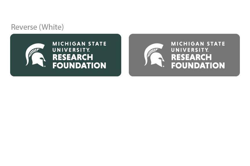
For special uses (such as embossing, foil stamping, embroidery, or one-color printing) Single-Color versions in Spartan Green, Black, or another approved brand color may be used on white or light backgrounds. The Reverse (white) version is designed for dark or mid-tone backgrounds and dark photographs.
In all cases, ensure the background compliments the logo and does not compromise its visibility or integrity.
Space & Size
Maintain adequate clear space around the logo to preserve its visual impact and legibility. Use a minimum margin equal to the height and width of the “O” in “FOUNDATION.” More space is encouraged whenever possible.
For print, the minimum width is 2 inches (Wide) or 1.5 inches (Stacked).
For digital use, the minimum width is 600 pixels (Wide) or 450 pixels (Stacked).
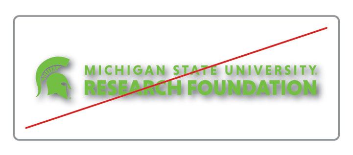
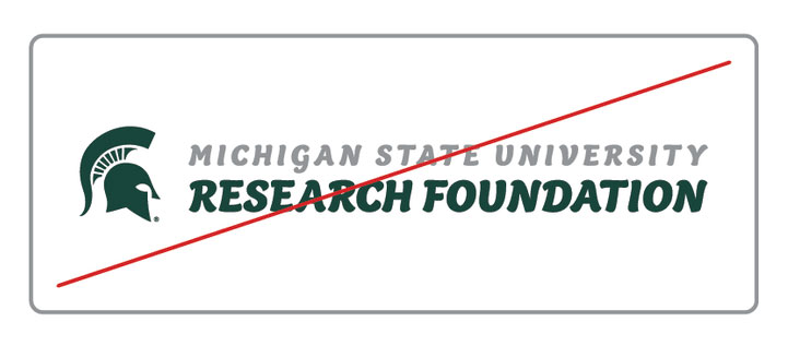
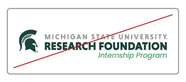
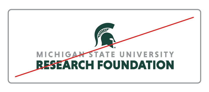
Incorrect Use
Improper use of the logo can weaken brand recognition and compromise its legal protection. Do not alter, separate, distort, recolor, or recreate any element of the logo. Always scale proportionally from the original vector artwork.