Logo
OVERVIEW
The MSU Research Foundation logo consists of the Michigan State University helmet (“University Mark”) and a stylized representation of the organization’s name (“Wordmark”) designed for optimal recognition and readability. There are “standard” (wide) and “stacked” (square) variations of the logo; prioritize the version that best fits the available space.
WORDMARK
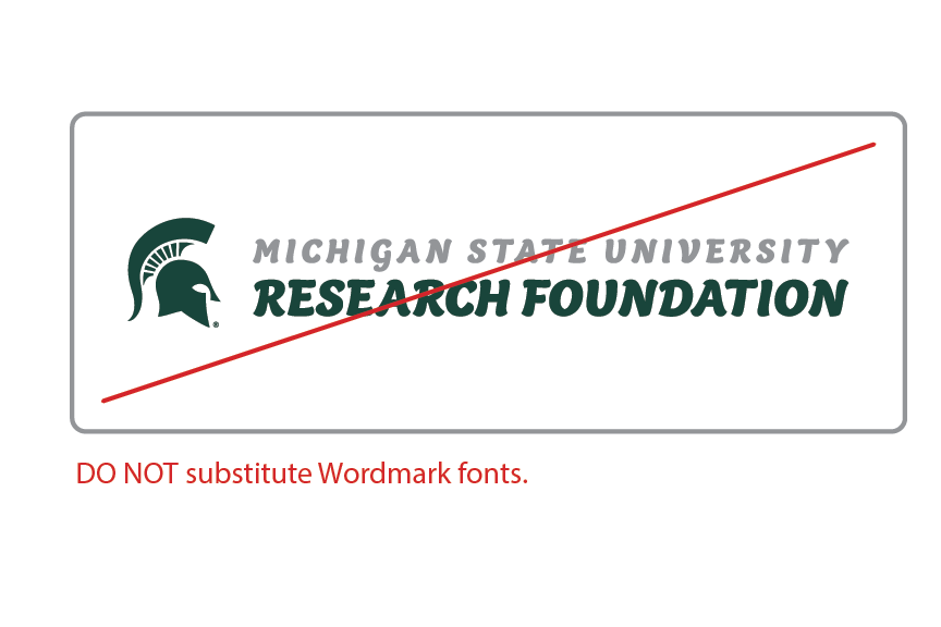
The wordmark is the standardized graphic representation of the MSU Research Foundation name. Niveau Grotesk was chosen as the wordmark font for its clean, classic appearance and excellent readability, even at smaller sizes. The font incorporates subtle design elements that create a visual connection to existing University branding, while remaining distinct from all University affiliates.
(For embroidery applications, Niveau Grotesk may be substituted with a similar sans-serif font. Please contact the Director of Communications for assistance.)
LOGO COLORS
The logo includes two colors: SPARTAN GREEN and MEDIUM GRAY. In certain applications, it may be appropriate to reproduce the logo in a single, brand-consistent color, such as SPARTAN GREEN, BLACK or WHITE.
BACKGROUNDS
The 2-Color version of the logo is suitable for use on white or light backgrounds, as well as light-colored photographs. Ensure there is adequate contrast between the background and all font colors, especially Medium Gray, when using the 2-Color logo.
For special applications like embossing, foil stamping, embroidery, or situations where color output is not available, Single Color versions may be used. Single-Color versions in Spartan Green, Black, or other brand-appropriate colors are suitable for use on white or light backgrounds or light-colored photographs. The Reverse (White) version of the logo is intended for use on dark or mid-tone backgrounds or dark photographs.
In all cases, it is crucial to ensure that the background colors or imagery compliment the logo and do not compromise its integrity.
SPACE & SIZE
To preserve the integrity and visibility of the logo, avoid crowding it with type, imagery, or other graphic elements. Always maintain a minimum clear space around the logo, equal to the height and width of the “O” in “FOUNDATION” (use even more clear space whenever possible). For print applications, the minimum size of the logo should be 2 inches (standard) or 1.5 inches (stacked) wide. In digital applications, the logo should have a minimum size of 600 pixels (standard) or 450 pixels (stacked) wide.
INCORRECT USE
Changes or improper use of the logo, no matter how small, can significantly diminish the impact of our brand identity and may compromise our ability to protect it legally. As a general rule, do not alter, separate, reposition, or recreate any part of the logo, other than proportional scaling of the original vector artwork.
Here are some common incorrect uses to avoid:
LOGO FILES
To ensure the best quality and appropriate use of the logo, several file types and color modes are available on SharePoint. Please contact the Director of Communications if you need specific sizes and/or file types for a particular use.


